Discover How we created A Reminder and Family Tree App to Help People Stay Connected
Unveiling Our Technological Magic: Read our journey of crafting an app for unbreakable connections
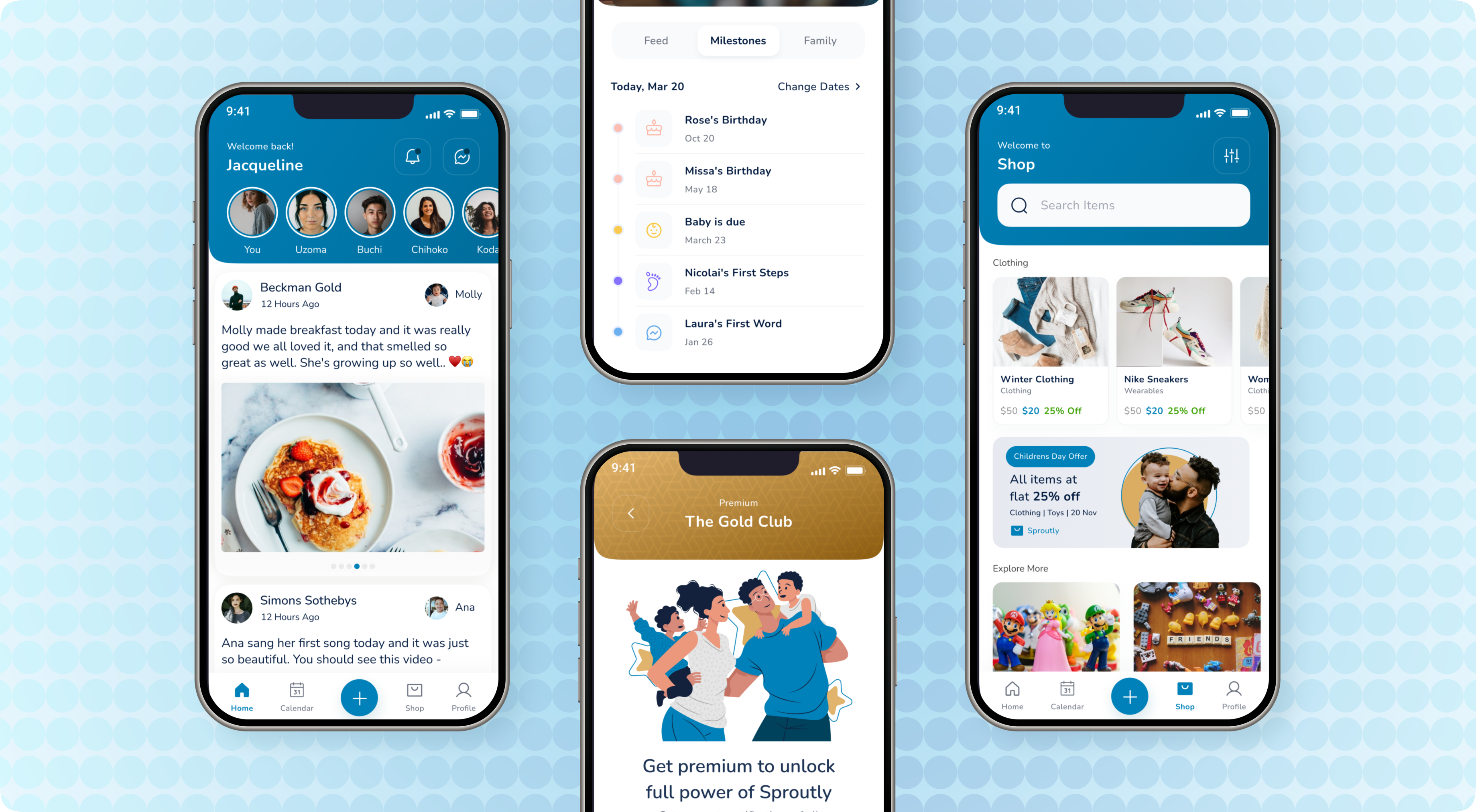
Project Overview
Our client approached us with the idea of making our special ones even more special. In the busy world, we live in, it is easy to forget an important day.
Period:
3-4 Months (Development of Second Phase)
Client location
United States
Business Model:
Dedicated Team
Services Used
User Experience Design
User Interface Design
iOS Development
Quality Analysis
Data Protection
Technologies Used
Swift
Laravel
MySQL
AWS Cloud
The Problem
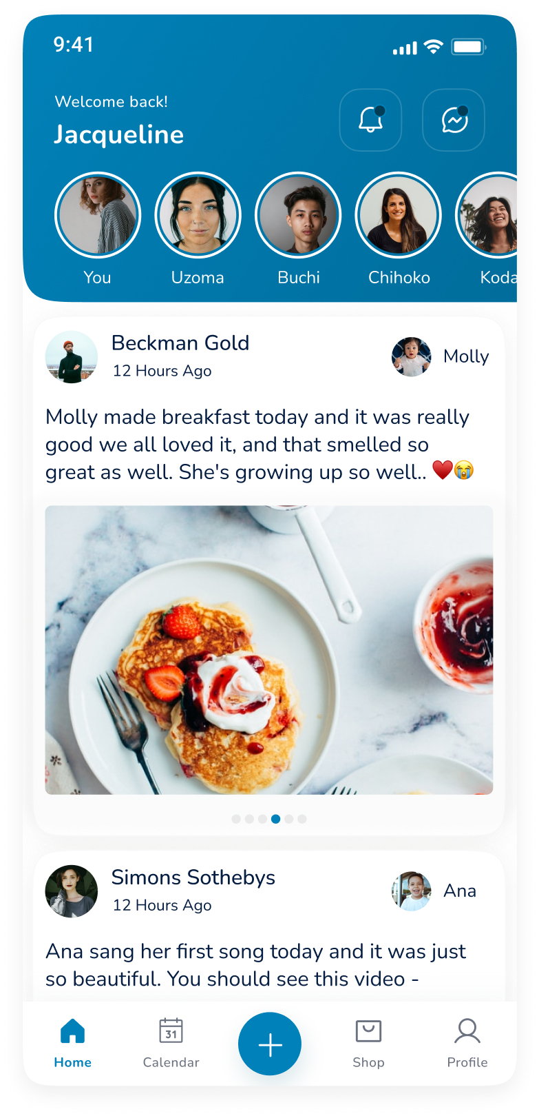
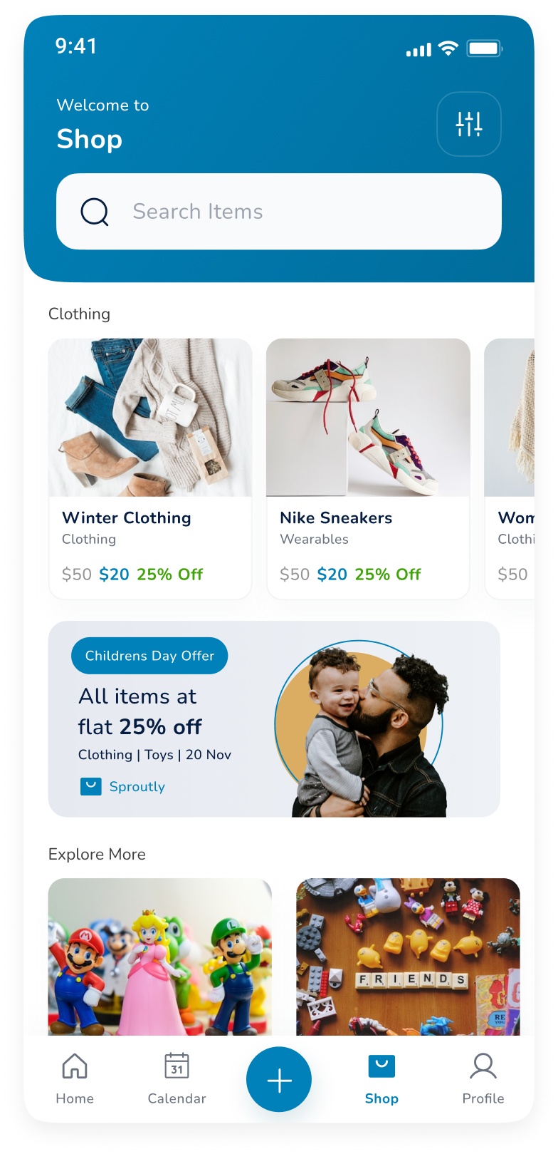
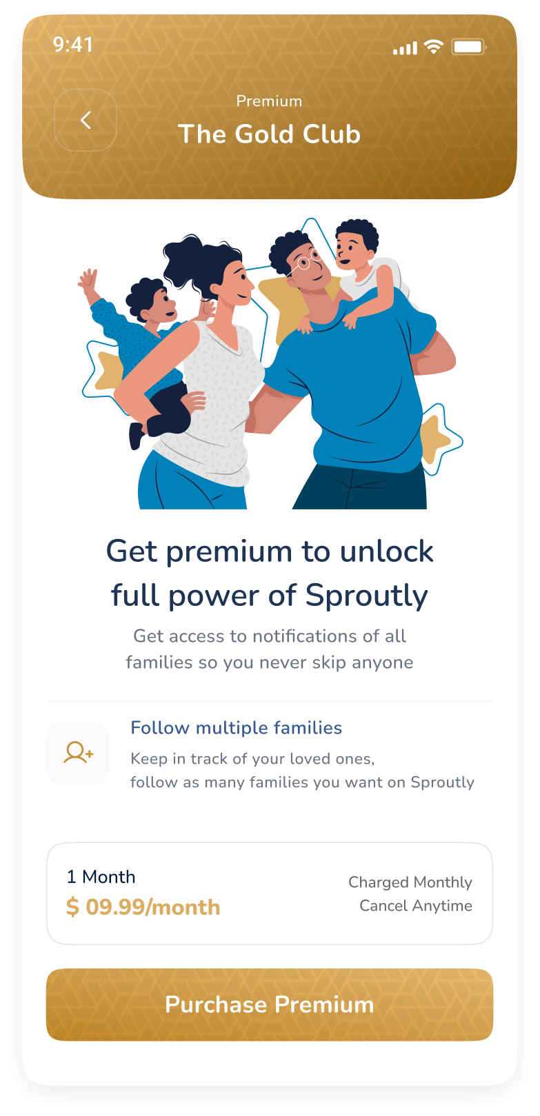
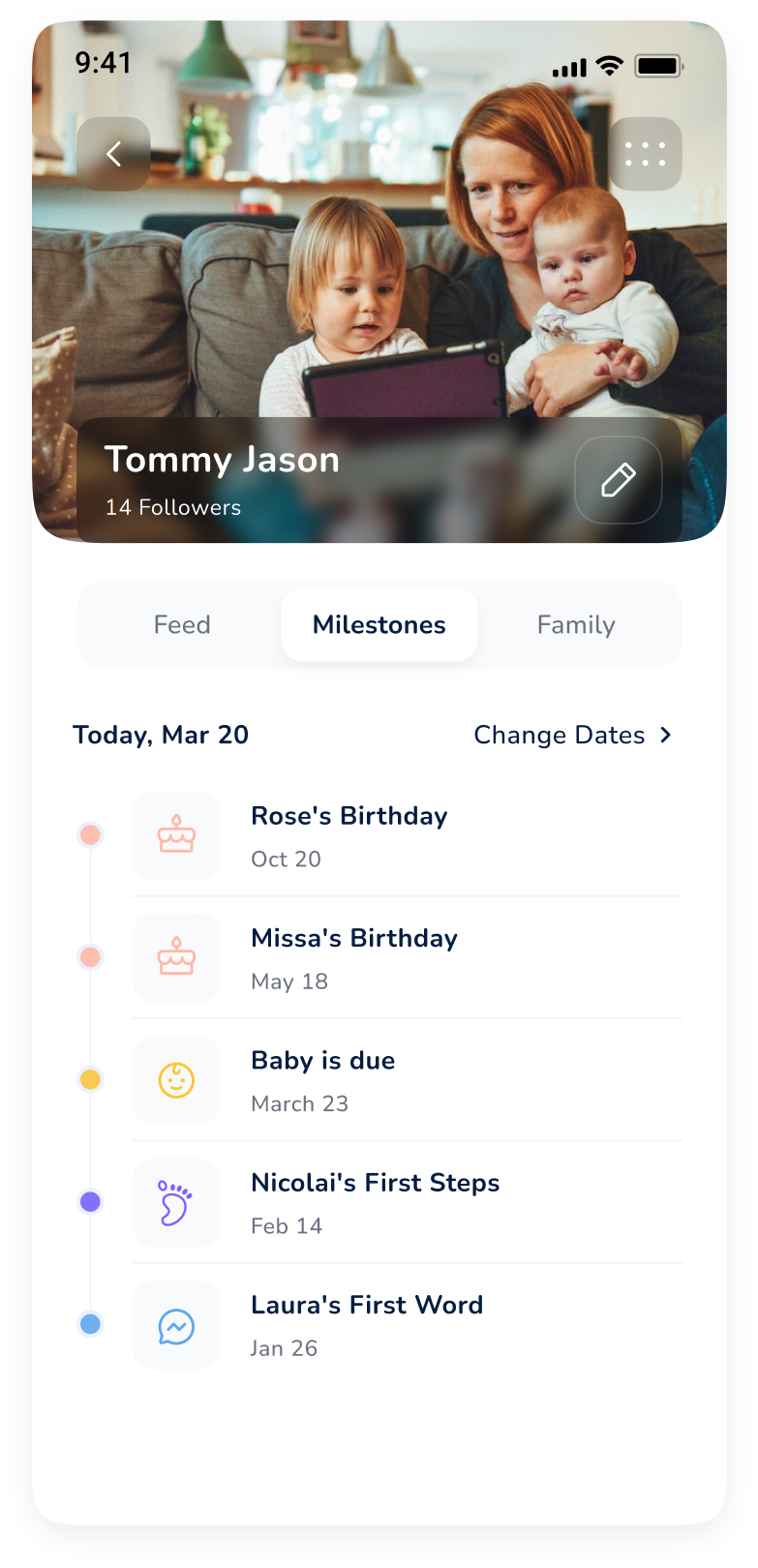
Our client came to us with the novel idea of creating a family and reminder app that reminds busy people of important dates. If you’re having a busy week at work, don’t forget to remember your mother’s birthday or your anniversary.
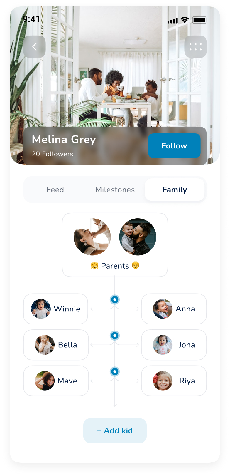
Plus, how cool would it be if we could remember every step of the pregnancy and create a family tree from it? Our client required an app with a simple, user-friendly interface that anyone could use.
What Impact we wanted to Make
Our vision was to make a reminder app so that people could never miss out on cherishing their loved ones.
The Solution
Before starting on the project we held multiple rounds of communication with our client to understand every fine detail and understand the essence of the product. The mind behind this app had a vision of creating a UI that appeals to different demographics, something that can be used by a grandma and a teenager. To make it appealing to a large target audience of different age groups, we spent a lot of time brainstorming and conceptualizing until we found the right fit. An agile approach helped us reduce costs and maintain transparency while delivering high-quality work.
01
Ideating the concept
After a detailed ideation phase for our reminder app, we focused on UI/UX design, deciding to turn every date into a slide that would remind users upon opening the app. The result was simplistic, elegant, and effective, evident from the client’s smile. Our key guidelines included user-friendly navigation with a fluid design, a fun way to remind users of important dates, robust data security, conveying the brand image through the UI, and easy commands to ensure usability for all demographics.
02
User Experience Design and User Interface Design
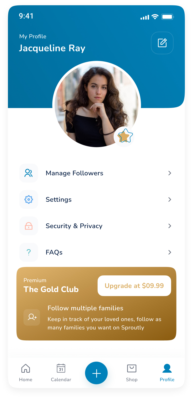
The developmental phase started in close collaboration with our clients so that they could constantly be updated about the developments. The client was given a free hand to suggest any changes at any time so the app could be precisely developed as per the vision of the founders. In the second phase of development, our team of developers implemented building a smooth onboarding process for users. We also added the features of editing profiles, blocking users, app notifications to users (with CRON logic).
03
Mobile App Development
Multiple quality checks were made before and after the app launch to ensure the app was delivered in practice as well as it did in theory. We maintained close contact with our clients so that the bugs could be reported and fixed at the earliest to keep the promise of quality assurance alive and kicking.
04
Quality Checks


Conclusion
The biggest challenge was to design an app for a 26-year-old young professional and a 76-year-old grandma who has a difficult time remembering dates.
We wanted to maintain the simplicity of the app along with an easy-to-use user interface. This was a project based on sheer creativity and collaboration, dedication, and hard work.
Ready to Get Started?
Get a free quote and see what we can do for you.


